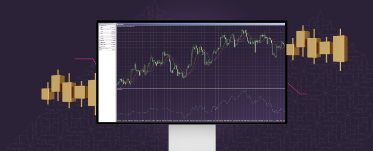
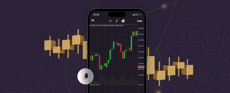
Forex charts are an integral part of trading. Most of the information that traders absorb comes from them, and understanding charts can significantly deepen market understanding.
However, for new traders, they can be quite confusing. Take a simple line chart, for example.
It’s clear that the line represents price movement, but which price points does it show? Most would intuitively assume that it’s the average price for that point, but that’s not the case.
This article will explain the most common forex chart types and clear up such misconceptions.
Line forex charts
Since line charts were mentioned already, they are a good starting point. On an intuitive level, they are fairly simple to understand. The x-axis represents time, and the y-axis represents the price of the asset at that time.
Where the confusion comes in is what the price points are, and fortunately, that confusion is easy to clear up. The line connects closing prices for the chosen timeframe. If you don’t know what a timeframe is, don’t worry, it’s the next thing covered in this article.
Line charts are useful for traders who want a quick overview of how an instrument has moved and where it is at the current moment. However, since they only show a single price point, these charts provide limited information. As a result, most traders who want a deeper overview choose candlestick charts, which I explain later in the article.

Timeframes
Timeframes are crucial to understanding charts. They dictate how data is grouped and presented, and can give significantly different overviews depending on the one traders select.
In essence, they determine how much time each data point for price encompasses. In a one-minute timeframe, each point in a line chart will show data for one minute. This is likely to make the chart more irregular, since it shows more movement. A one-hour timeframe will make each point show data for an hour, smoothing out smaller movements within.
New traders sometimes make the mistake of thinking that a more detailed view is always better. However, that’s not necessarily true. When analysing past market performance, for instance, it may be better to cut out the noise and get a cleaner overview of how prices moved with timeframes that span hours to weeks.
Conversely, if someone wants a detailed overview of what’s happening right now, they choose a timeframe that spans minutes or even seconds.
Timeframes aren’t complex, but they give traders some versatility in how they approach things. As such, it’s best to experiment and see how different the market can look when using different timeframes.
Candlestick forex charts
As mentioned, candlesticks are the other prominent chart types, and while they are less common to see as a non-trader, most traders prefer them. Simply put, they give a lot more info than line charts.
A candlestick chart consists of candlesticks, each of which represents a data point depending on the selected timeframe. So, for a one-hour timeframe, a candle will show data during one hour of trading.
At first glance, they are much more confusing than line charts, but once you get the hang of them, they are quite easy to read. A single candlestick has three parts: a thick part in the middle called the body, and two protruding parts from the top and bottom called wicks or shadows.
How to read a candlestick on forex charts
The body can be green or red, which indicates whether the price rose or fell during that period. If it’s green, the bottom indicates the opening price and the top the closing price, and if it’s red, it’s the other way around. The wicks always indicate the same thing, with the one on top being the highest price point during a timeframe, and the bottom the lowest.
Special cases in forex charts
Some confusion may occur when traders encounter a candlestick with one, or, even though this happens extremely rarely, both wicks missing. Not to worry, as that simply means that the highest or lowest price matches the opening or closing price.
When the body is red and there’s no top wick, it means that the opening price was the same as the highest price. When there’s no bottom wick, it means that the closing price matches the lowest price. Also, when the body is green and there’s no top wick, the instrument closed at its highest price. If the lower wick isn’t there, the asset’s opening matches its lowest price.
When read, this may not sound that clear, but on a platform, it’s not difficult at all to identify these situations.

Patterns
In technical analysis, analysts believe certain patterns can trigger specific market movements. Some communities overemphasize this idea, and new traders often hear that these movements always follow the patterns, but that’s not true.
However, with a good mix of fundamental knowledge and trading experience, these patterns can be a quick way to determine a trading route. This is especially useful for high-intensity trading tactics like scalping, popular among forex and CFD traders.
There are thousands upon thousands of patterns, and it’s best not to overwhelm you with them. However, a few examples are in order to help traders understand what patterns look like and how they are applicable in trading.
Double top and double bottom:
- Price forms at two peaks or two lows at about the same level. It indicates that a trend is weakening and a reversal is in order.
Head and shoulders and inverse head and shoulders:
- Three peaks or lows, where the middle is the highest or lowest. Indicates that traders tried to break a resistance level and failed, thus signaling a reversal.
Triangles (Symmetrical, Ascending, Descending):
- Symmetrical triangles appear when prices are converging into a narrowing range. This indicates market uncertainty. Ascending triangles appear with a flat top and a bottom that’s closing in, and indicate a breakthrough into a bullish market. Descending triangles are the opposite, with a flat bottom and sloping top, showing bearish pressure. It’s important to note that the left side should be viewed as the base of these triangles, not the bottom, as one may intuitively assume.
Patterns are a useful tool, but they shouldn’t fuel one’s trading. There are so many, and fairly similar ones can indicate different things. Furthermore, sometimes market participants intentionally move against a pattern. As such, they are far from set in stone, and should be viewed as a suggestion rather than a rule.

Conclusion
Technical analysis is an extremely rich area of forex trading. Not only are there so many small things to learn about it, but also a wide array of tools that traders can employ to aid them in their market inspection. Some platforms, like Trading Central, are almost entirely devoted to giving more technical analysis options to traders.
For those interested in learning more about technical analysis, indicators are something that they should consider learning more about. These tools usually introduce additional unbiased, data-based information on charts that traders can use to inspect the market in more detail. Additionally, traders who like technical analysis can spend the time they devote to education to learn forex charts.
The important thing to note is that, while most traders end up preferring technical or fundamental analysis, at least some knowledge of both is needed to truly understand how markets function. It’s wise not to simply pick the one that you prefer, but educate yourself on both, so you can become a self-sufficient, well-rounded trader.
Disclaimer: This information is not considered investment advice or an investment recommendation, but instead a marketing communication.


