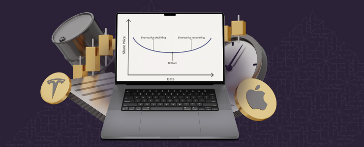
Se alguma vez se deparou com um gráfico e pensou que se tratava apenas de linhas e velas, não é o único. Por trás desses movimentos de preços, existem formas que dão pistas sobre a direção do mercado de negociação. Essas formas são padrões gráficos e os negociadores as utilizam há décadas como guias para o que está por vir. Os padrões mostram se um preço provavelmente continuará seu movimento na mesma direção ou se está prestes a mudar.
O que é interessante sobre os padrões gráficos é que não é necessário saber matemática ou usar fórmulas complicadas para utilizá-los. Com a prática, começará a notá-los naturalmente. Depois de conseguir identificar esses padrões, poderá usá-los para melhorar o seu timing, evitar movimentos errados e tomar decisões de negociação mais informadas.
Continue a ler para saber mais sobre alguns dos padrões mais importantes, como eles podem alterar a sua estratégia de negociação e a sua visão dos mercados.
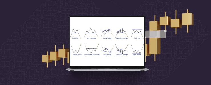
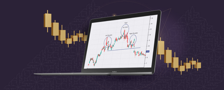
Padrão gráfico cabeça e ombros
Este padrão está entre os sinais de reversão mais fiáveis. Pense em três picos consecutivos, em que o do meio é o mais alto, também conhecido como cabeça, e os outros dois à direita e à esquerda são mais baixos, conhecidos como ombros. A linha traçada entre os mínimos é chamada de linha do pescoço. Quando o preço cai abaixo da linha do pescoço, isso geralmente significa que a tendência de alta chegou ao fim e que o preço pode começar a diminuir.
Existe também a versão oposta, conhecida como cabeça e ombros invertidos. A única diferença é que ela está invertida, aparecendo frequentemente após uma longa tendência de queda, indicando que o preço pode começar a subir novamente. Esse padrão é amplamente preferido entre os traders devido ao facto de ser fácil de identificar e ter a tendência de ser um pouco mais preciso em comparação com outros.
Padrões gráficos de topos duplos e fundos duplos
Este é outro tipo comum de padrão de reversão. Um topo duplo é semelhante à letra «M» e ocorre quando o preço sobe, desce e depois volta a subir para quase o mesmo nível. No entanto, não consegue continuar a subir, o que significa que o mercado tentou duas vezes ultrapassar esse nível, mas não conseguiu. Por isso, pode começar a descer.
Um fundo duplo é o contrário, parecendo a letra «W». O preço desce, sobe, desce novamente para quase o mesmo nível e depois sobe. Isto é uma indicação de um forte suporte no mercado nesse nível e de que ele pode começar a subir. Estes padrões são vitais porque geralmente mostram o ponto em que os compradores e vendedores ficam mais fracos e a tendência está pronta para mudar.
Triângulos e cunhas
Os triângulos são padrões de continuação. Isso significa que eles geralmente indicam que a tendência existente continuará após o término do padrão. Um triângulo simétrico ocorre quando os preços continuam a atingir máximos mais baixos e mínimos mais altos, formando uma forma estreita e comprimida.
Um triângulo ascendente tem um topo plano e uma base ascendente. Enquanto os vendedores mantêm o nível superior, os compradores ficam mais fortes, empurrando lentamente o preço para cima. Na maioria das vezes, o preço acaba por quebrar para cima. Pelo contrário, um triângulo descendente tem uma base plana e máximos mais baixos, e geralmente quebra para baixo. Esses padrões gráficos são úteis para identificar a direção do preço após um período de movimento lateral.
Embora, à primeira vista, as cunhas sejam semelhantes aos triângulos, existe uma diferença fundamental. As cunhas são padrões em que ambas as linhas apontam na mesma direção, seja para cima ou para baixo. Uma cunha ascendente ocorre quando os preços continuam a subir, mas começam a mover-se em passos menores. Isso pode ser um aviso de que a tendência ascendente está a enfraquecer e pode diminuir em breve.
Por outro lado, numa cunha descendente, os preços movem-se para níveis mais baixos, mas os passos tornam-se menores e mais próximos uns dos outros, mostrando que os vendedores estão a perder força e que o preço pode subir assim que romper. As cunhas não aparecem com tanta frequência em comparação com outros padrões. No entanto, quando aparecem, podem dar dicas muito úteis sobre o que pode acontecer a seguir.

Bandeiras e flâmulas
Este padrão gráfico geralmente aparece quando há um movimento inesperado nos preços. Digamos que haja uma forte alta. Após um movimento tão grande, o preço faz uma pausa, movendo-se lateralmente ou um pouco contra a tendência. Isso cria uma pequena forma que se parece com uma bandeira. Pouco depois disso, os mercados geralmente continuam na direção inicial com outro movimento forte.
Apesar de serem semelhantes, as bandeiras são como triângulos muito pequenos, em vez de retângulos. Bandeiras e flâmulas são padrões de continuação de curto prazo que os traders costumam usar para entrar em mercados que se movem rapidamente, sem perseguir o grande movimento inicial.
Copo e alça e fundos arredondados
O padrão copo e alça é um padrão fácil de identificar. Imagine uma forma de «U», semelhante a uma chávena de chá, seguida por uma pequena depressão, a alça. Quando o preço ultrapassa a alça, isso geralmente leva a um forte movimento ascendente. Os traders utilizam este padrão para identificar uma pausa saudável antes do próximo impulso ascendente.
Um fundo arredondado, também conhecido como pires, é outro padrão gradual que indica uma mudança de direção. O preço muda gradualmente de uma tendência de queda para uma tendência de alta, em vez de oscilar rapidamente para cima e para baixo. Embora a formação possa levar algum tempo, quando ocorre, geralmente dá início a uma tendência de alta mais prolongada.
Padrões de gráficos de velas
Alguns padrões não levam semanas para se formar, mas aparecem em apenas uma ou duas velas. Por exemplo, um padrão de vela doji se forma quando os preços de abertura e fechamento de uma vela são quase os mesmos, mostrando incerteza e uma possível reviravolta no mercado.
A vela envolvente é outro padrão comum de velas japonesas. Aqui, uma vela cobre completamente o corpo da vela anterior. Uma vela envolvente de alta, que aparece quando há uma tendência de queda, indica uma reversão para cima. Por outro lado, uma vela envolvente de baixa pode funcionar como um aviso de queda.
As velas martelo e enforcado têm corpos pequenos e pavios inferiores longos e sugerem reversões com base na sua localização no gráfico. Quando utilizadas com uma análise cuidadosa, as formações de velas podem fornecer sinais úteis a curto prazo, apesar do seu tamanho reduzido em comparação com as formas maiores mencionadas acima.
Como usar padrões gráficos
Aguarde sempre um sinal claro antes de tomar qualquer ação. Um movimento forte acima ou abaixo de um nível-chave é mais confiável quando é apoiado por atividade de negociação suficiente. Isso ajuda a evitar sinais falsos, que podem levar os negociadores a tomar decisões erradas.
Os níveis de suporte e resistência devem ser levados em consideração, pois muitos padrões se formam em torno deles. Os padrões que rompem níveis importantes são geralmente mais confiáveis do que aqueles em níveis menores.
Combine esses padrões com outras ferramentas, como cronogramas ou notícias do mercado, e sempre use uma gestão de risco sólida, como ordens de stop loss.
Considerações finais
Os padrões gráficos são úteis, mas não garantem o sucesso. Eles tornam a sua abordagem de negociação mais eficaz e as suas decisões mais informadas. Os padrões gráficos não prevêem o futuro, mas fornecem pistas úteis sobre o que pode acontecer. Ao aprender a identificá-los, pode ver melhor o equilíbrio entre compradores e vendedores e perceber oportunidades de negociação que, de outra forma, poderia perder.
Isenção de responsabilidade: Estas informações não devem ser consideradas como conselhos ou recomendações de investimento, mas sim como uma comunicação de marketing.